
Nothing is colored in nature, we just see colors. Colors come from light. The spectrum of light visible to our eye can see when sunlight passes through the prism, because the light is refracted into seven visible colors.
Color depends on our perception of things, it is unrealistic because every being sees things differently colored; see that color from the spectrum that bounces off an object.
Over the centuries, colors have changed their meaning depending on time and cultures. The ancient Celts used colors to describe the elements that make up the world, and the Inidians in America viewed colors as the basis of spirituality. Even psychologists like Freud have explored the impact of color on humans.

Colors are still full of meaning today: it flooded, looking through pink glasses or green with envy … blue blood, yellow print …
Do colors have a specific meaning or does their meaning differ depending on how they are used in branding and marketing? According to color psychology, colors have fixed meanings and this can be a factor in why we love some colors more than others.
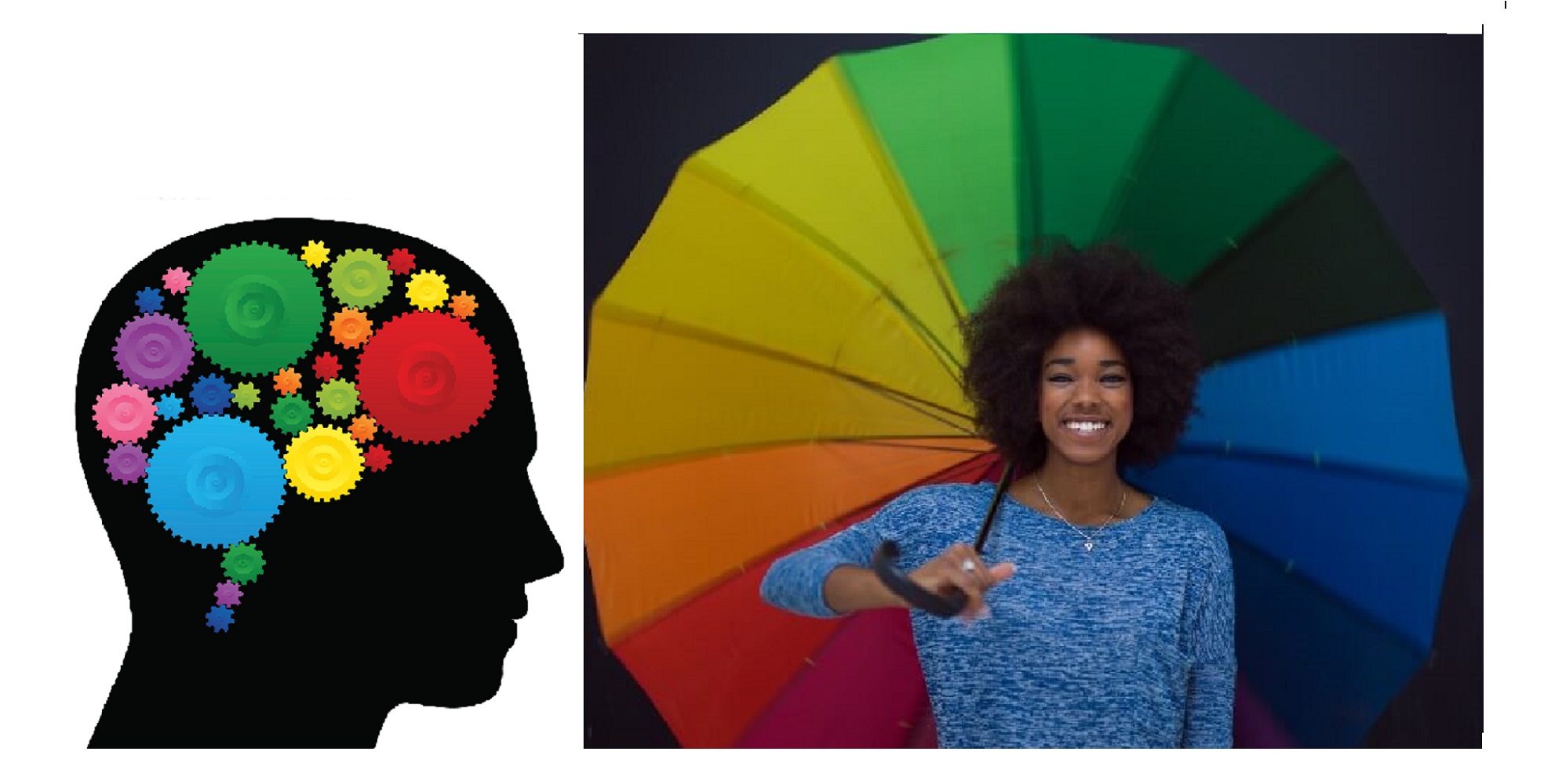
Colors affect people not only visually but also psychologically. Even Egyptians, Chinese, and Indians believed in the power of colors to heal a person, and it is true that certain colors influence the changing blood pressure, and other physiological functions.
Colors affect our mood
– blue soothes
– while red can upset us.
Colors are all around us, we see them with the eye, beautifying our everyday lives or not, everything is in the eye of the beholder.
The psychology of colors
Colors have different psychological effects on people, are associated with emotional states and memories, and this psychological impact depends largely on the individual’s personal affection for some colors. Today’s science seeks to find a link between color preference and human behavior, and there are many studies that have found a link between human character and a sense of colors.
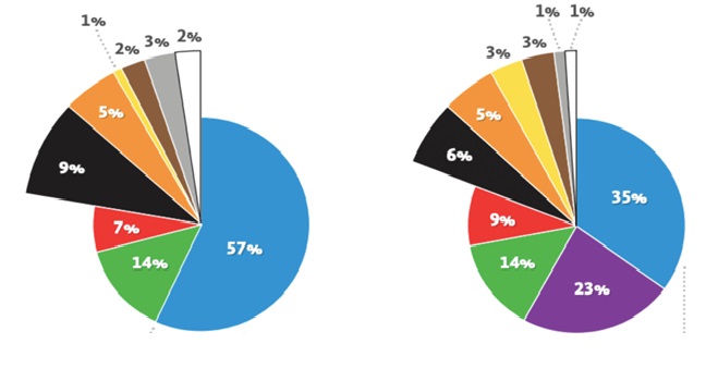
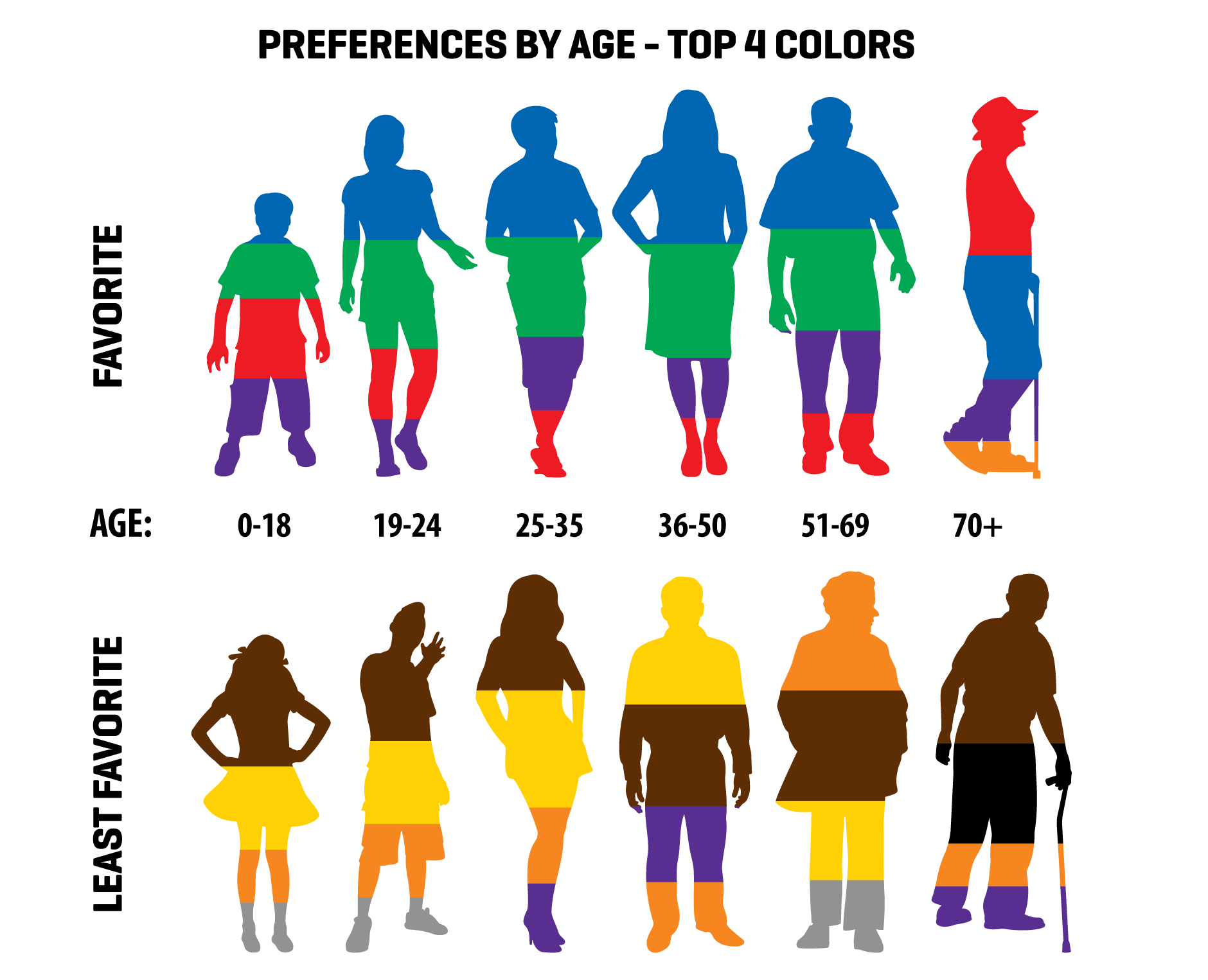
Is there a gender difference in color? Different studies continue to show that men and women have different tastes when it comes to color choices. Studies show that men prefer bright, contrasting colors, while women prefer softer shades. Both men and women love blue and green, but many women love purple while this color repels men.
Colors preferred over age.
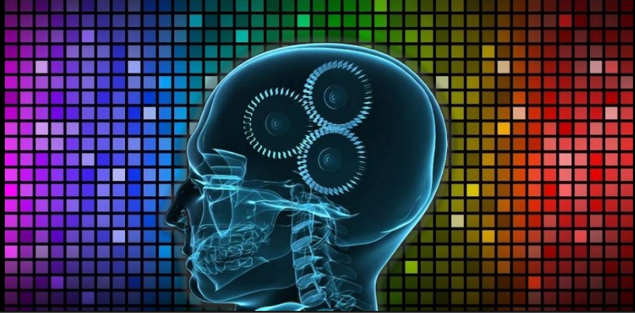
Colors that affect people. Whether we are aware of it or not, they play an important role throughout our lives. They affect all our senses; sight, sound, smell, taste and feelings. They can have a positive or negative effect. They can start thinking and provoking reactions.
Psychologically, colors can cause fatigue, increase stress decrease visual perception, visual impairment increase possible worker errors.

RED COLOR: It is considered the color of fire and blood, so people associate it with energy, war, danger, power and determination. It also ties in with passion, love and intense human feelings. Because the blood is red, it is often associated with greed and aggression. People who love the red have been shown to be open and confident, respond impulsively and often get into conflicts.
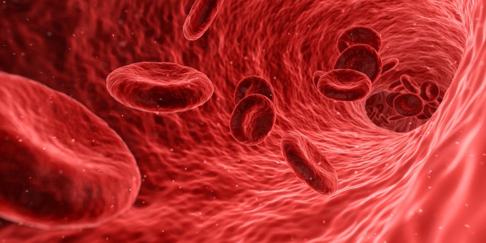
Red in marketing – is the color of the action. It’s an emotionally powerful color, it encourages people to make quick decisions (“CLICK HERE” “BUY”).

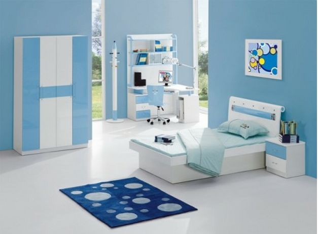
BLUE COLOR: It is considered the color of peace and tranquility and is associated with intellect and consciousness. As people associate colors with the environment, blue is the color of the sky and therefore the sea is bound by depth and stability. It also symbolizes loyalty, wisdom, trust, intelligence and serenity in many cultures. It slows down human metabolism and lowers blood pressure and has a calming effect on humans. People who like blue do not like conflict, they are patient and emotional.
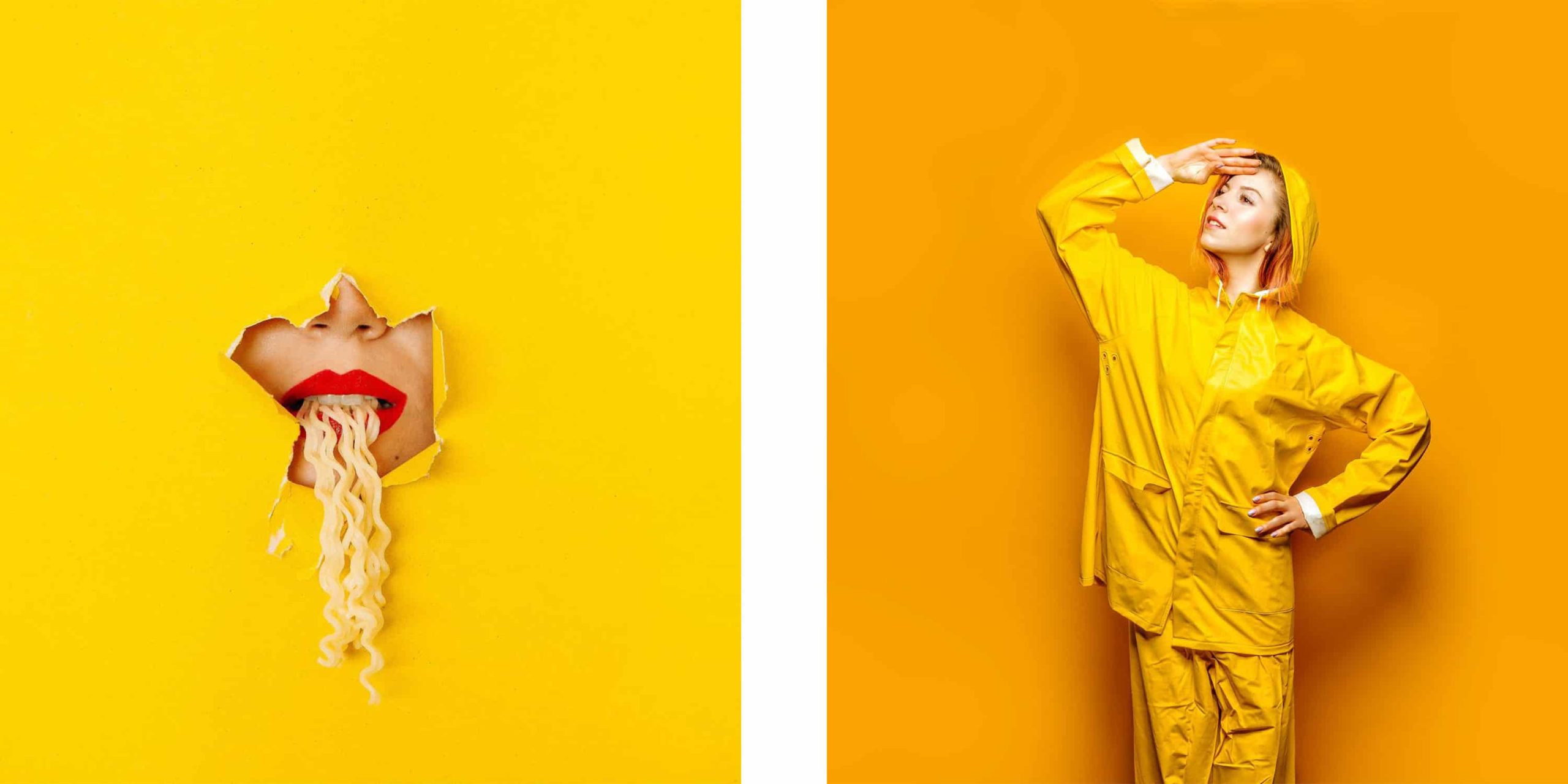
YELLOW: Because of the highest reflection of all colors, yellow is the first color that the human eye perceives. It is the color of sun, light and optimism. With its intensity, penetration and radiance it creates a warm effect and encourages joy. If we want to attract attention, we use yellow, but with its use one must be very careful. Too much use can be disturbing. We use it to advertise products we want to highlight, baby products, and related items.
GREEN: The most comfortable color to look at is green, the most resting of the human eye. It symbolizes growth, harmony, freshness and fertility. People who love green are cheerful and well-meaning and easily adapt to the environment. Some of the virtues that embellish them are honesty, perseverance and diligence. We associate dark green with ambition and the financial world. On flags and coats of arms it is a symbol of growth and hope.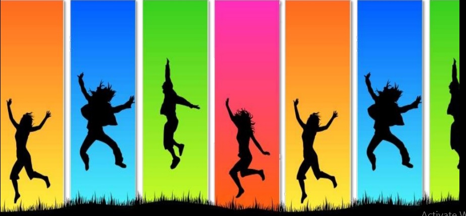
PURPLE: A mysterious, mystical and somewhat unusual color that symbolizes power, nobility, luxury, ambition and combines extravagance and wealth. Thanks to Queen Elizabeth and the British Parliament, it became a 19th century fashion sensation. Only nobles and rich people had the opportunity to wear purple clothes because painting synthetics with purple was very expensive.

Leonardo da Vinci believed that purple color promotes meditation. It was one of the favorite colors of the Egyptian Queen Cleopatra.
People who love purple embellish some of the virtues such as elegance, creativity, imagination, a good sense of aesthetics and harmony.
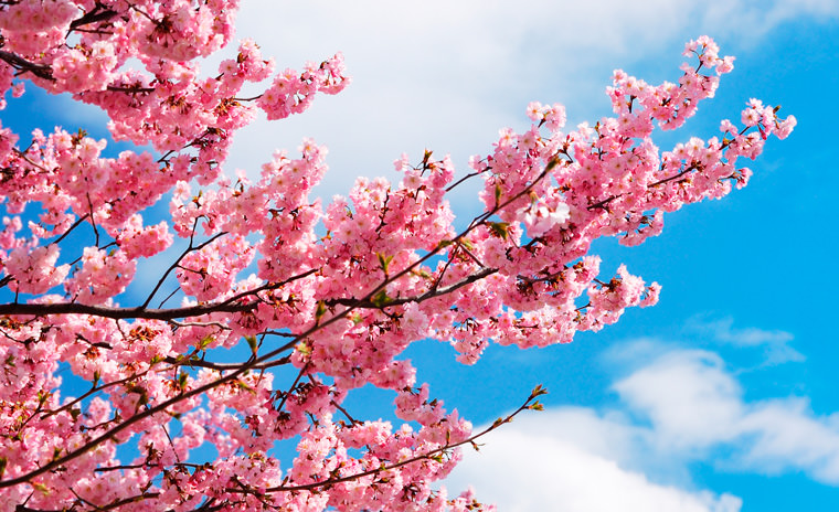
ROSE-PINK: Pink is one of the delicate colors, partly red, but still mild. It is the color of love and sensitivity. According to tradition, we consider her to be a woman of color and that is why most girls clothes are pink. People love her, or they don’t. Helps to express sensitivity and lessens feelings of guilt. Too much pink leads us into a fantasy world, separating us from reality.
ORANGE: Orange is the color of fire and sun, intensity, power and life. It associates us with sunrise and sunset. By mixing red and yellow, we get an orange color that causes people to feel warm by associating us with fire. We often associate it with autumn, food and spices. Darker orange tones associate us with comfort and protection. If we want to emphasize some elements, orange is the ideal color for this. It is used to attract attention and highlight the most important elements in design.

It is often used in interior decoration because it stimulates sales, encourages thought and conversation. All shades of orange have equal meaning and impact. People who love orange are fun, cheerful, highly educated, sociable, sensitive and very social.
WHITE: White is a special color that some do not consider color. Represents all colors in one. It is a symbol of purity, truth, peace, kindness, innocence and protection. At the same time, it signifies everything and nothing. Until 1966, the kitchen elements were white. As a result, human sensitivity to hygiene has increased. We use it to emphasize honesty and simplicity, for charities and medical equipment. People who like white are usually quieter types who have strong moral control.
We use it to emphasize safety with medical devices. We also use it to advertise low calorie, low fat and dairy products. White is by definition a compound of all colors of the spectrum and is not a color. It is therefore the brightest, visually lightest and very comfortable for large areas.
BLACK: With black we associate strength, elegance, formality, death, evil and mystery associated with the fear of the unknown (black hole). Black gives a sense of depth and perspective. People who like black act cool and serious, are proud and determined, and more often depressed. If used on large areas, it can be depressing. Black clothes are worn by young women who want to look older and more elegant, men who want to give the impression of seriousness and people who believe that they look thinner in black clothes.
Using color psychology to your advantage is really easy. It is also a fantastic investment in yourself because you will end up with a whole wardrobe where every piece is complimented and can be used over and over again for years.

Colors tell us more than we read from them, and it’s important to find, at least to some extent, what colors affect us to organize our world and our colors.
A.M.
Balkantimes.press
Napomena o autorskim pravima: Dozvoljeno preuzimanje sadržaja isključivo uz navođenje linka prema stranici našeg portala sa koje je sadržaj preuzet. Stavovi izraženi u ovom tekstu autorovi su i ne odražavaju nužno uredničku politiku The Balkantimes Press.
Copyright Notice: It is allowed to download the content only by providing a link to the page of our portal from which the content was downloaded. The views expressed in this text are those of the authors and do not necessarily reflect the editorial policies of The Balkantimes Press.