
Brandenburg’s modern, well-received logo tells the story of the nation
KSI / Brandenburg
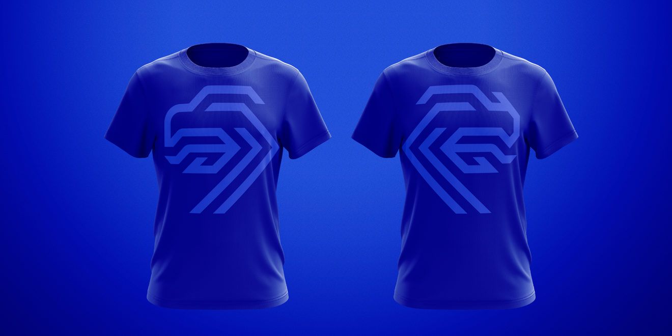
Image: Adweek
The world’s game, soccer, brings out more passion than just about any sport. In every corner of the globe, supporter loyalty is laid bare through jerseys, merchandise and tattoos of their beloved club or national team logo. Over the years, crests for country soccer federations have gone through some level of transformations, and were generally subtle or gradually got to where they are today.
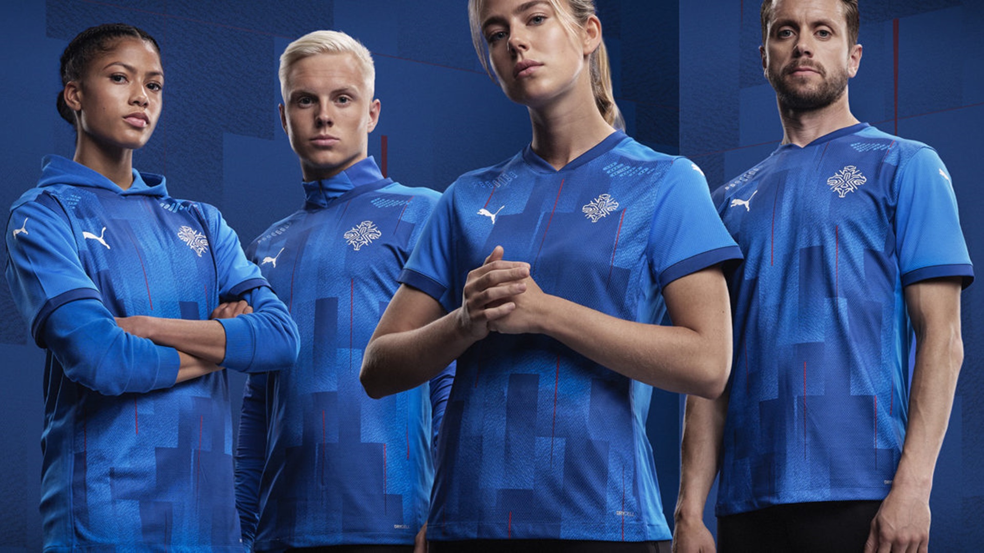
That is not the case with the national team identity for Iceland. At the beginning of the month, the country’s football association, known as KSI, launched one of the most interesting, visually compelling logos in soccer. The crest is a massive departure from its dull, tired predecessor and has one hell of a backstory.
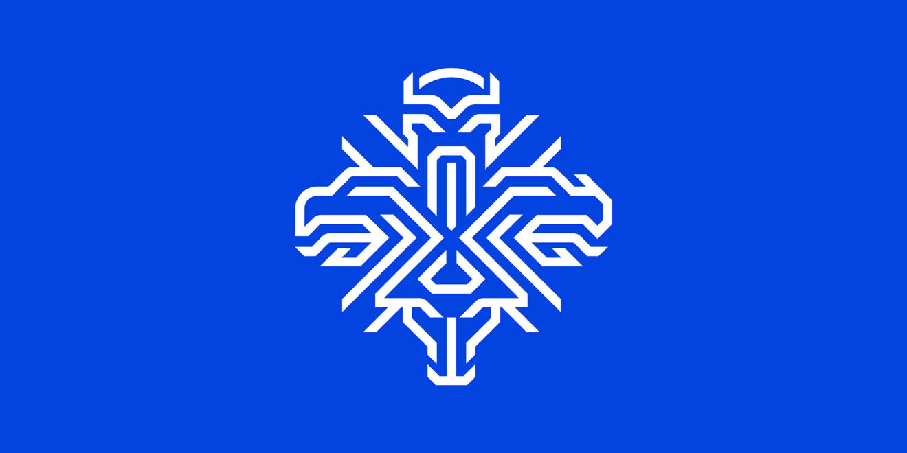
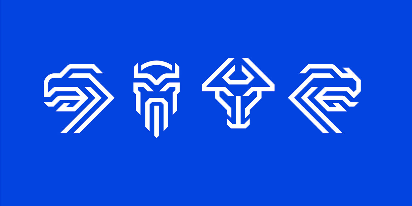
Not digging too deeply, the four guardian spirits of Iceland are a dragon, an eagle, a bull and a giant, all of which are on the nation’s official coat of arms. Somehow, agency Brandenburg managed to design an impressive logo that incorporates all four in a modern way.
“People have been calling for us to use the national crest of the jerseys for years,” said Hrafn Gunnarsson, the Brandenburg creative director that led the project. “But the law prohibits it, since it’s only for governmental use.”
The agency looked toward federation identities from places like the Netherlands, Germany, the United States and England as they developed Iceland’s look and feel. Gunnarsson noted that most of the backstories involved animals, while Iceland’s heritage was steeped in its more expansive folklore.
“There’s a thin line,” he said, noting the balance of form, function and meaning. “We wanted it to be really modern, but still have a deep connection with our heritage.”
According to Gunnarsson, the four protectors, though individual, often came together with a fighting spirit, which he says is indicative of Iceland’s national soccer team.
“It emphasizes the strength in our history but also stands for togetherness,” he said. “That’s the Icelandic team spirit. We don’t have huge stars [on the teams], so if we win something, it’s as a team.”
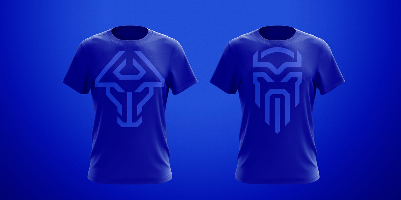
The launch site is incredibly in-depth and informative. While it could be overwhelming to spin a yarn about such a high-profile project, the story is cohesive, makes perfect sense and is engaging. The site also includes the complete rationale and direction of the logo, a bespoke font and usage of not just the full crest, but the individual guardian spirits.
Reaction to the new identity is overwhelmingly positive, with influential design site Brand New saying “Do Not F**k with the Icelandic,” and gushing over the change. USA Today was equally impressed with the results, especially the video.
Another audience has a say in the identity’s success: the players on the men’s and women’s teams.
There was a running joke about people not wanting to tattoo the previous logo on their bodies, which unofficially ended up in the creative brief from the federation. Iceland men’s national team captain, Aron Gunnarsson, has the country’s crest tattooed on his back.
According to Hrafn Gunnarsson, the midfielder “was quite fond of what we were doing with a take on the national crest and protectors for the logo.”
Adweek / Balkantimes.press
Napomena o autorskim pravima: Dozvoljeno preuzimanje sadržaja isključivo uz navođenje linka prema stranici našeg portala sa koje je sadržaj preuzet. Stavovi izraženi u ovom tekstu autorovi su i ne odražavaju nužno uredničku politiku The Balkantimes Press.
Copyright Notice: It is allowed to download the content only by providing a link to the page of our portal from which the content was downloaded. The views expressed in this text are those of the authors and do not necessarily reflect the editorial policies of The Balkantimes Press.